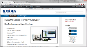
Main content is center and “Additional Information” content is on the right when there is enough horizontal space. Otherwise the Additional Content is below the Main Content.
While content varies from page to page, there are some guidelines for each.

Main Content Guidelines
Appropriate image should be on the top right.
Main content for product pages should start off with Key Performance Specifications, Key Features, or something similar unless it is a simple product. We’ll define a simple product a little further along.
Main content for Technology or similar pages should start off with an Overview. This section could be explicitly named or unnamed (meaning calling out section title with <h1>Overview</h1>.
“Additional Information” Content Guidelines
All sections use Heading 2 <h2</h2> tags. Do NOT use Heading 1 tags here!
For a product page, this section should start with Documentation and list, at a minimum, the product/family datasheet.
For a product page, this section should end with the appropriate development cycle image. Heading 2 title is Family. Then Add Media. You can search using keyword swoosh to find all images. You must use the 120px image here!
Content and Styles
Do everything you can to not use custom formatting beyond the following list of acceptable content
- Headings 2, 3, and 4 <h2>, <h3>, <h4> Do NOT use Heading 1 <h1>
- Paragraph <p>
- Preformatted <pre>
- Bold <strong>
- Italics <em>
- Strike-through <del>
- Simple ordered lists aka numbered lists <ol>
- Simple unordered lists aka bulleted lists <ul>
- Blockquote <blockquote> as long as the entire paragraph(s) stand alone.
- Links <a>
- Dictionary Lists <dl>, <dd>, <dt> (see below)
- Images (see below)
- Columns (see below)
- Tables (separate page here)
- That’s it!
Images
Images should only be added using the ‘Add Media’ button.
Images should be moved around and positioned using the existing WYSIWYG editor that is available when you edit the Image Details. If you DO NOT want a caption, remove it here. DO NOT remove it from the Media Library! Never remove the alternate text. Use the Alignment, Size, and Link To properties.
To add an image border add img-border to the Image CSS Class textbox.
Never open a link in a new tab.
Columns
You can recommend that sections of content be displayed columns.
Switch from Visual to Text view to view the content markup. Navigate to the first section of content you want in columns.
You need to indicate where the columns begin and end and you need to indicate the data for each column. You will do this with divider tags <div> and classes.
Indicate the beginning and end of the columned content with a divider open and close tag with two class names. The first class name is stddiv-container. The second class name is stddiv-container-columns[x]. Replace [x] with 2, 3 or 4 for the number of columns requested. Then, indicate each column with divider open and close tags with a single class name of stddiv-col. Here is an example with the divider column stuff highlighted blue.
<div class="stddiv-container stddiv-container-columns2">
  <div class="stddiv-col">
    <p><strong>Here is one column of data.</strong> This is a long sentence to show it wrapping
       or not wrapping and doing something who knows what. When will it end?
       No one knows.</p>
  </div>
  <div class="stddiv-col">
    <p><strong>Here is a second column of data.</strong> This is a long sentence to show it wrapping
       or not wrapping and doing something who knows what. When will it end?
       No one knows.</p>
  </div>
</div>
And here is the code rendered.
Here is one column of data. This is a long sentence to show it wrapping
or not wrapping and doing something who knows what. When will it end?
No one knows.
Here is a second column of data. This is a long sentence to show it wrapping
or not wrapping and doing something who knows what. When will it end?
No one knows.
Dictionary Lists
Dictionary lists may be used and are especially useful for tabular type data. These are great for data that you may be tempted to create tables for. Usually these lists are better than tables. The are good for product nomenclatures. See the MA5100 Series Memory Analyzer (bottom of page) for an example of how to use dictionary lists to build a list nomenclatures.
Unfortunately this is not available in the Visual editor. You can add these to your page using the Text view. An example coding is:
<dl>
 <dt>Term A</dt>
 <dd>Term A definition line 1.</dd>
 <dd>Term A definition line 2.</dd>
 <dd>etc.</dd>
 <dt>Term B</dt>
 <dd>Term B definition line 1.</dd>
 <dd>Term B definition line 2.</dd>
 <dd>etc.</dd>
</dl>
And here is the code rendered.
- Term A
- Term A definition line 1.
- Term A definition line 2.
- etc.
- Term B
- Term B definition line 1.
- Term B definition line 2.
- etc.